.webp)

This 'Rule-Breaking' Product Page Converted Over 4%: Why Emotion Beats Best Practices

A few years back I talked a client out of the best product page they had, and it took me a quarter to undo the damage.
The page sold a scented homewares product. A candle range, roughly $40 a unit. And the page was, by every checklist I'd ever followed, a mess. No clear hierarchy. No scannable bullets up top. No tidy benefit grid. Just a wall of warm, story-led copy about a smell and a memory, running long before it ever mentioned a single feature.
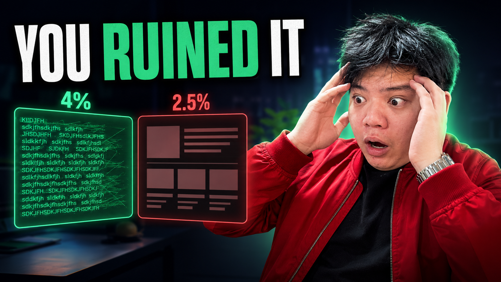
It was converting a touch over 4%. For a $40 considered purchase off cold Meta traffic, that's a genuinely good number.
So I did what I'd been trained to do. I "fixed" it. Crisp headline, three benefit bullets, a feature grid, plenty of white space, the lot. Textbook. And conversion rate fell to a bit under 2.5% over the next three weeks. We'd more than halved it by making it tidier.
That page taught me something I now believe down to my boots: best practices are how you hold attention. Emotion is what does the actual selling. Mix those two up and you'll optimise the life right out of a page.
What I'd actually built when I "fixed" it
Here's the thing I'd missed. The original page wasn't messy by accident. It was messy because it was busy doing the one job that matters, which is making someone feel something.
The story version put you in a scene. The smell, the room, the time of day, a specific memory it pulled you back to. By the time the copy got round to wax type and burn time, you already wanted the thing. The features weren't the pitch. They were the reassurance.
My tidy rebuild did the opposite. It led with the rational stuff, the burn time and the bullet list, and quietly assumed desire would look after itself. It didn't. I'd handed people a spec sheet and expected them to fall in love with a spec sheet. Nobody does.
To put the gap in perspective: at roughly $40 AOV and, say, 30,000 sessions in a month, the move from ~4% to ~2.5% is the difference between about 1,200 orders and about 750. Same traffic, same product, same price. I deleted a third of the sales by following the rules better.
The teardown, side by side
Let me put the two versions next to each other, because the contrast is the whole lesson.
The opening. The tidy page opened with a benefit headline and three bullets. The emotive page opened mid-scene, describing the smell as if you were already in the room. One informs you. The other makes you want.
The middle. The tidy page listed features in a neat grid. The emotive page told a short story, and only after the feeling had landed did it justify the feeling with the practical detail. Desire first. Proof second.
The reviews. Both pages had reviews. But on the emotive page the reviews echoed the exact feeling the copy had built, people describing the smell and the mood, not just "great product, fast shipping". They extended the desire rather than changing the subject.
The white space. The tidy page had loads of it. The emotive page had almost none. And here's the uncomfortable bit: the cramped page won. Not because clutter is good, but because the density was all desire, and there was nowhere for the reader's attention to leak out before they'd felt the pull.
The lesson isn't "clutter your pages". It's that white space, headlines and bullets are scaffolding for attention, and I'd treated the scaffolding as if it were the building.
Why emotion sells and logic only justifies
There's an old idea in copywriting that people skim before they read. Most visitors aren't reading your page top to bottom. They're scanning the bits that jump out, and only stopping to read properly when something hooks them.
So you've got two jobs, and they're different jobs.
The first is meeting people where their attention is. That's what headlines, subheads and bullets are for. They're a courtesy to a skim-reader, a set of handholds down the page. Get them in the right order and someone can skim your headlines alone and still follow a coherent story.
The second job, the one that actually closes, is making someone want the outcome badly enough to buy. That's emotion. That's the smell, the scene, the version of their life with the thing in it. No bullet grid has ever made anyone feel that.
Here's how I'd frame the relationship now. Desire is the engine. Logic is the permission slip. People decide with feeling and then reach for a reason to justify what they've already decided. So your job on a product page is to build the want first, hard, and then hand them the rational cover they need to click buy without feeling silly.
That's the move my tidy rebuild got backwards. I led with the permission slip and never built the want. You can't justify a desire that isn't there yet.
A quick caveat, because I don't want this to read as "emotion always, logic never". The higher the price and the higher the perceived risk, the more proof you need, and the more of it. A $40 candle can run almost entirely on feeling with a light dusting of reassurance. A $300 device that goes on your skin cannot. There you still lead with the dream outcome, but the justification underneath it has to be heavier: the clinical bits, the demonstrations, the authority. The order stays the same. Desire first, then justify. The ratio is what changes.
How we test this for clients now
I don't trust my own taste on this anymore, and I'd gently suggest you don't fully trust yours either. The candle page cured me of that. So we test it.
The cleanest test I know is to run two genuinely different product pages against the same traffic and let the money decide.
- Version A, the bullet page. Tidy, benefit-led, scannable, feature grid, the best-practice build most brands already have. This is usually the control because it's what's live.
- Version B, the emotive long-copy page. Story-led, sensory, desire built before any feature is named, reviews chosen to echo the feeling, justification sitting underneath the want rather than in front of it.
Same product, same price, same offer, same ads pointing at both. The only variable that moves is whether the page leads with feeling or with features. Then I watch conversion rate and, just as importantly, AOV and refund rate, because a page that wins on conversion but tanks on returns hasn't actually won.
A couple of things I've learned running this for brands.
One, the emotive version doesn't always win, but when it wins it tends to win big, and it wins most clearly on considered, identity-led, sensory products. Things people buy because of how they'll feel, not just what they'll do.
Two, you find the page's real essence by using the product, not by staring at a brief. Sit with the thing. The detail you keep coming back to, the one small experiential bit you'd mention to a friend, that's usually the emotional core the whole page should be built around. On the candle it was never the burn time. It was the memory the smell pulled up.
Three, write your headlines so they tell a coherent story on their own, in order, with nothing in between. If a skim-reader can run their eye down just your subheads and still feel the pull, the page is doing its first job. Then the emotive body does the second.
Where to from here
If I could go back, I wouldn't have touched that candle page until I'd tested my "improvement" against the original instead of assuming the tidy version had to be better. That assumption cost a third of the sales for a quarter.
So the question I'd put to you is a simple one. Look at your best-selling product page and ask honestly: does it make someone want the thing before it starts justifying the thing? Or have you, like me, quietly optimised it into a spec sheet because a spec sheet is easier to build and feels more "professional"?
If you're not sure which way your page leans, that's exactly the kind of thing a fresh pair of eyes can spot in an afternoon. A Signal/Noise Audit will read your page the way a cold visitor does, tell you whether it's selling a feeling or reciting features, and show you where the desire is leaking out before the buy button. Sometimes the most profitable change on a page is admitting the tidy version was the problem.