.webp)

The Squint Test: The 2-Second Quality Bar Every Static Should Pass Before It Spends

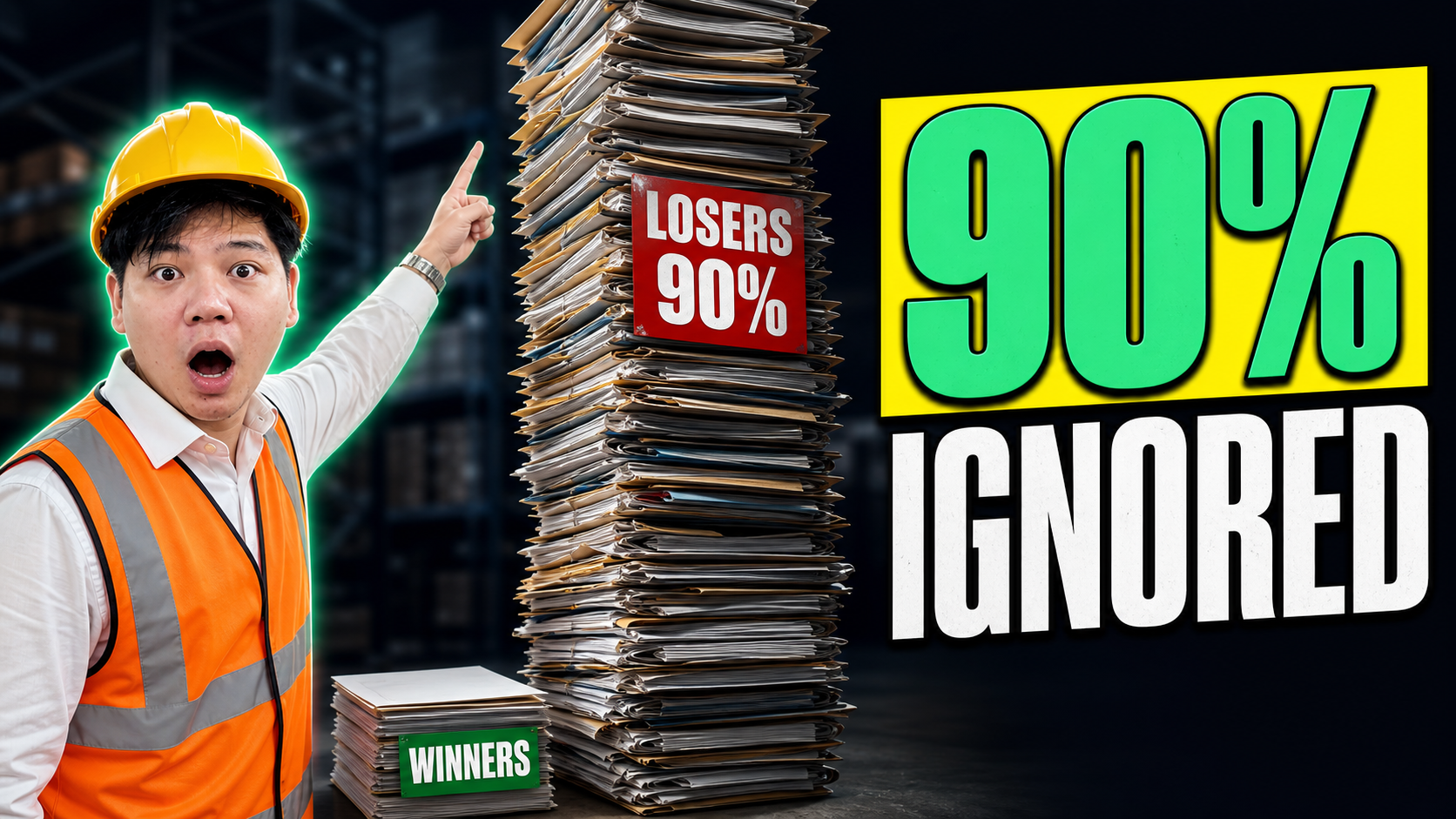
The prettiest static in your account is probably one of the worst performers, and I can usually tell before it's spent a dollar.
Not because it looks bad. Because it takes too long to understand. Polish and clarity are not the same thing, and Meta only pays you for clarity. A gorgeous ad that needs three seconds to decode loses to an ugly one a stranger gets in half a second, every single time. The thumb doesn't reward art. It rewards comprehension.
So before any static or thumbnail goes live, we run one quick check on it. We call it the squint test, and it costs nothing.
What the squint test actually is
Pull the ad up on your phone, then squint at it so the detail blurs out. Or just hold it at arm's length and glance for a beat, the way someone would mid-scroll.
Now ask the only question that matters: do I know what this is and why I'd care, right away? Or are there too many words, too many competing elements, too much to untangle before it lands?
That's it. If the message survives the blur, it'll survive the feed. If you have to stop squinting and actually study it to get the point, your customer won't bother, because they were never going to study it in the first place.
It matters most on the hook and the headline, the bits doing the heavy lifting in those first frames. The whole job there is to be received instantly. You're trying to shrink the time-to-comprehension down as close to zero as you can.
Why two seconds of comprehension predicts the thumb-stop
Here's the thinking behind it, because the test makes more sense once you see why it works.
Whoever's scrolling your ad is not in a smart, focused frame of mind. Reading a book is a smart state - you're leaning in, working at it. Scrolling a feed is the opposite. Notifications popping, thumb already moving, half-watching. You are writing for that state, not the careful one. The brain on the other end is skimming at speed and bins anything it can't parse fast.
So comprehension is the gate. The faster someone grasps your static, the more likely the thumb stops. The longer it takes, the more likely they're gone before the message even lands. A slow-to-read ad doesn't get a fair hearing and lose. It never gets heard.
That's why I trust the squint test over a focus-grouped opinion on whether an ad is "nice". Nice is a smart-brain judgement made by someone staring at it. Thumb-stop is a skim-brain reflex made by someone barely looking. The squint test puts you in skim-brain on purpose.
Two before-and-afters
Let me make it concrete with a couple of invented examples, both very typical of what crosses my desk.
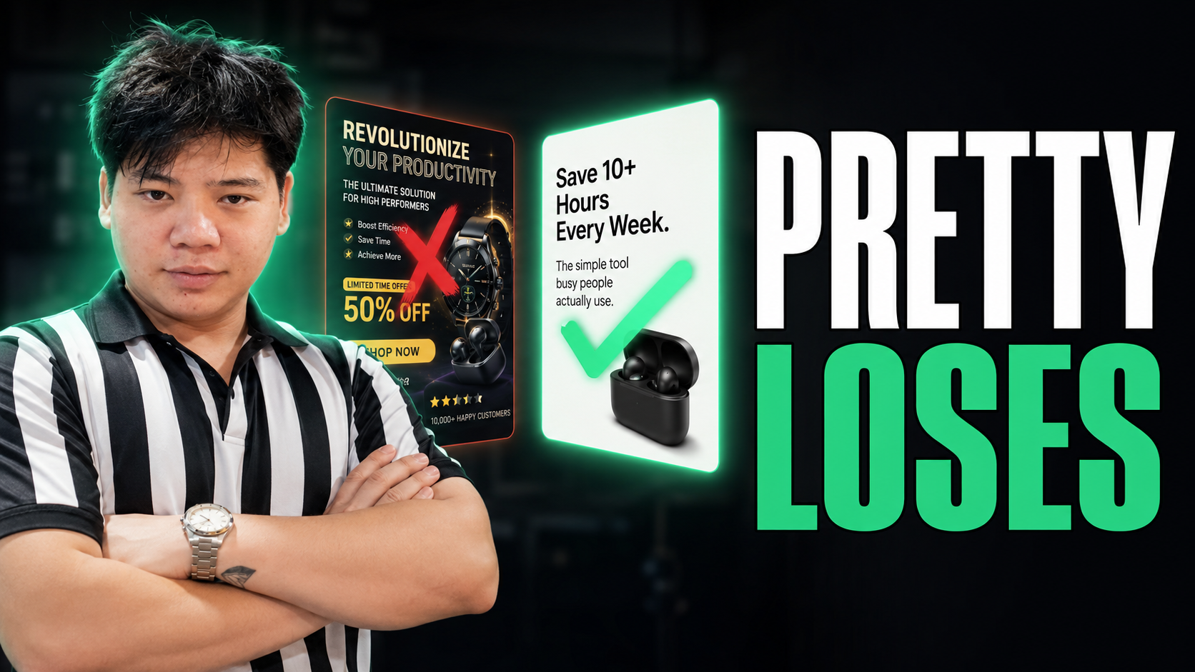
A skincare static. The before: a clean studio shot of the bottle, a tasteful headline reading "Clinically Formulated Radiance Complex", three supporting lines of ingredient copy underneath, a logo, a discount badge in the corner. Squint at it and the whole thing dissolves into grey texture. Nothing survives. Five elements all shouting at once, so none of them lands. The after: same bottle, one line of text, big and high-contrast - "The 3am-skin fix". Squint and you still read it. One idea, instantly. That's the version I'd put money behind, and not because it's prettier. It's the opposite of pretty. It's just legible at a glance.
A supplement thumbnail. The before: a founder mid-sentence, mouth half-open, busy kitchen behind her, small caption stretched across the bottom in a thin font. Blur it and you get a person and a wall of mush. No idea what it's about. The after: same founder, but frozen on a clear expression, the background knocked back, four fat words across the middle - "Stop the 4pm crash". Squint and the message holds. Same footage. The difference is whether one idea is allowed to dominate the frame.
In both, the winner isn't the better-looking asset. It's the one that says a single thing loud enough to survive the blur.
The pre-flight checklist you can run yourself
You don't need us for any of this. Here's the exact check we run on every static before launch, and you can run it on your next batch today.
- One idea per frame. If you're trying to land two messages, you'll land zero. Pick the strongest and cut the rest.
- Read it blurred. Squint or step back. If the main message disappears, the text is too small, too long, or fighting too much around it.
- Three-second rule on the headline. If a stranger can't grasp the headline in about three seconds, shorten it. Cut adjectives, cut clever wordplay, cut anything that needs a second read.
- Contrast before beauty. The message has to pop off the background hard. A subtle, on-brand palette that blends the text into the image is a comprehension killer, however lovely it looks.
- Mute and glance. Look at it for one beat the way you'd catch it in the feed, not the way you'd inspect it in a folder. Your honest gut answer in that first glance is the real result. The thumb-stop data only ever confirms what the squint told you.
Most weak creative fails one of these obviously, and you can feel exactly which one in about ten seconds, before you've burned a cent of media.
So here's what I'd do this week. Pull your last five statics, squint at each one, and be honest about which message actually survives the blur. The ones that don't aren't bad ideas. They're good ideas buried under too much. This pre-flight pass is one of the simplest creative habits we run for the brands we work with, and it's yours to copy wholesale. Which of your live ads would survive a squint right now?